Retail lighting design tips: 3 budget-friendly tips from the experts
What do you think of when you hear the phrase "lighting design?" Our lighting design team has prepared a few simple retail lighting design tips to help make your retail store look better. In fact, dialing-in your lighting may help make your store more attractive to your customers.
Tip 1: Walk your stores and view them from your customer’s perspective

Walking through your stores in-person is a great way to notice common problem areas. If it looks "off" to you, it probably looks off to everyone. You may find it helpful to make reviewing your displays and stores a monthly habit. Scheduling time once a month or even once a quarter to walk one of your retail locations from a customer's perspective can help you keep tabs on design consistency and possible problem areas.
Here are some questions you can consider during your walk-through.
- Where are my eyes drawn when I look at the store?
- Where are my eyes drawn once I walk into the store?
- Does it seem simple to find what you are looking for? (Lighting should make it clear.)
- Is there enough contrast between important displays and the general sales floor?
- How does my merchandise look?
- Are there any dark spots in my store?
- Are there any burned-out light bulbs?
- Are there any areas that distract me or divert me because of glare?
Tip 2: Point your lighting where you want your customers to look
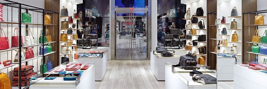
Over time, maintenance work – moving retail displays or bumped light fixtures – can take the focus off your lighting off the products you're trying to sell. We often see fixtures aimed at blank corners, flooring or even the ceiling, leaving the products for sale in the dark.
Simply aiming your accent lighting so that the key products and displays are well lit can make a huge difference in how your stores feel when a customer walks in. In fact, some studies have been done that link the quality of lighting in retail spaces to greater sales. Some practical steps you can take right away include:
- "Aim" your light fixtures at the key areas or products in your store.
- Look for darker and brighter areas in your store. Are the brighter spots focused on product or displays?
- Consider how much light you're putting on displays and product. As a rule of thumb, areas with three times or more light than the surrounding areas will "pop" for customers.
- Is your window display lit well enough, or will customers only see their reflection in the window? Pro tip: Storefronts should typically be five to six times brighter than general lighting.
- If you've had a chance to review a location in person, it might be worth taking some before and after pictures to send to other locations. This will encourage consistency and address common problem areas.
Tip 3: Test how new lighting looks in your store before you upgrade
There have been some huge advances in lighting technology and efficiency over the last several years, but we are finding that the old ways we used to evaluate technology (like "Color Rendering Index") aren't always a true indicator of how lighting will look in your store. The industry is working on new ways to evaluate and compare products, but while those are being developed a few critical questions can save you from a headache down the road. Before you embark on a new lighting upgrade, here are some things you should consider:
- How do my products look under the new lighting? (Do they look "flat" or "drab"? Do they "pop"?)
- Does the new lighting produce as much light as my older lighting?
- Is the visual design of the new product distracting?
- What is the manufacturer's reputation in standing behind their products?
- Does the fixture or lamp design create unnecessary glare?
- Is the color of the light consistent from fixture to fixture?
- Is the color temperature of the lighting complementary to the finishes in the store? Pro tip: Cooler color temperatures may be more efficient, but they may not look the best with your store's design.
We hope these retail lighting tips help you keep your stores looking great. Remember that by taking these few simple actions, you can improve the impact of the lighting in your store without spending significant money. If you are interested in more on this topic, you might enjoy a copy of our Retail Lighting Design e-guide.
Looking for more on retail lighting design? Try to steer clear of these pitfalls: 6 of the most common retail lighting design mistakes.


